return to homepage A Review of the by Miles Mathis
return to updates
2007 ARC SALON
by Aron Wiesenfeld
click here to go to ARC Salon images
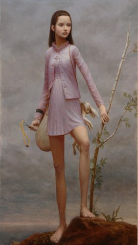
Actually, I saw quite a bit to like in this year’s Salon. I will get to that later. I like to finish on a positive note, so I will leave my favorites to the end. I will start by taking a close look at some of the winners, the honorable mentions, and the finalists. In 2005, my greatest complaint was that this was a web-based show, judged only from slides or jpegs. This must make it very difficult, if not impossible, to judge. It also makes it very difficult for me to critique the works, since, like the judges, I am looking at photos of paintings and drawings and sculpture, not paintings and drawings and sculpture. Not at all the same thing. As it turns out, my warnings in this regard were borne out by later events in past Salons, as some purchased works ended up looking much less wonderful in real life than they did before going through photoshop. Fred Ross, the director of these Salons, is to be commended for passing out large amounts of money to realists; but we need a bricks-and-mortar gallery or museum show, not only to make real judging possible, but also to create the kind of public relations that are necessary to art. People have to look at art with their own eyeballs, on a real wall or in the round. Traditional art cannot be experienced virtually. It has to be experienced directly. Only in a real setting can a show like this generate the kind of excitement and sales it deserves. The ARC Salon should have other major purchasers and financial supporters than Fred, and so far it doesn’t much. I don’t think it will until it finds a hook in a wall. Buyers will not feel a part of the show until they can score an invitation and a conversation and a snort of wine and cheese. Showing art, like showing anything else, is a social phenomenon; and the business of art is probably more social than most business. It needs a room where real bodies can mingle. As I said in regard to the previous Salon, I will try to get past this great wall of judging or reviewing by reviewing only those aspects I can make out with a fair amount of certainty. In other words, I feel pretty free to comment on subject matter or composition but less free to comment on color choice or other finer points of execution. If there is a possibility that my critique would fall before a better photo, I refrain from making it. My second biggest complaint—one I have made against all other realist shows—also stands with this one. The judges have presented us with a hierarchy that is standing on its head. Once again, the best works score the lowest and the worst score the highest. Even with the admitted difficulty in judging from photos, we still have another meltdown in judging here. Strangely, the introduction to the show does not say who the four judges were, although I assume one of them was Fred. I couldn’t find the prospectus. Apparently it was taken down. But that is OK. I am not here to embarrass anyone by name. It wouldn’t be any great slight to the judges anyway, since I have never yet seen a realist show that I thought was well judged. They are all complete mysteries to me, and this one simply joins them. In many realist shows there are high levels of nepotism and chumminess behind the scenes, even outright fraud, but I have no evidence of that here. I have never had any reason to believe that Fred is doing anything other than choosing the works he likes the best, and I must assume that with the other unknown judges here. I know that Daniel Greene has worked his way into Fred’s heart, and he does well here, but Mr. Greene also did very well in the first Salon he entered, before he and Fred met. So there is nothing to complain of in that direction, as far as I know. No, Fred is still full of goodwill towards realists and realism, and it shows here. The podium is upside down, in my opinion, but the overall slate of works is quite impressive. Many of the top realists in the world are here, represented by some very fine works. Best of Show went to Cody Swanson for his sculpture Adam. This is certainly an impressive work in many ways. In the body of his Adam there is a lot to like and almost nothing not to like. The hands and feet are amazing, as is the torso. A rare combination of beauty and power. My guild brother Van Nielsen agrees. He is very impressed by this work, even more than I am, and he called me up to tell me so. It is not hard to see why. The style is very much like his own, using the real clay to full effect. Adam even looks a bit like Van here. But honestly I don’t find this a completely successful work. In my opinion the face is over-sculpted. The expression goes too far, and the slight stylization we find in the body--with its exaggerated curves--becomes overwrought in the eyes. The face is not just expressive, it is mannered. It begins to look like a late Mestrovic, where the mania of the 20th century has begun to show. I am a huge fan of Mestrovic, don’t get me wrong, but when Mestrovic went too far he did it just like this. From the side, the expression almost fits the rest of the figure, but from the front our beautiful Adam begins to look a tiny bit monstrous. It is possible I am looking at a bad photo here, but I think the features could use a bit more refinement. Cody Swanson is a huge talent and a true sculptor, but I long for a bit more subtlety in his sculpting of this face. It makes me fear for the future. I don’t want to see him follow the pattern of MacDonald and Eichinger and most of the rest, pandering to a market for bathos and kitsch. Swanson is too good to do it, and I pray to the Muses that his success here does not motivate him in the wrong direction. In fact, I find his other entry Zachariah to be more completely successful. I would have judged Zachariah above Adam, and given it first place in sculpture. Zachariah is the best sculpture in the show, as far as I can tell from these photos. It is faultless. The execution matches the expression precisely. Swanson would seem to be at his best with older men like this. His female Herodias, while also stunning technically, fails for the same reason his Adam does. Her features are a tiny bit too large and too pronounced. This makes her strong from a distance, but unrefined close up. She and Adam just need to be a little bit prettier, to put it bluntly. Swanson tends to feature strength and expression over refinement and subtlety. It works out perfectly in Zachariah and the body of Adam, where all is as it should be. But in the other two faces, we are left wanting something. It is a small something, to be sure, but it is these small somethings that a judge is supposed to judge by. Phillippe Faraute is represented again by two very accomplished sculptures, the better of which is probably the female; but they aren’t quite as exciting as his entries of past years. Nonetheless, anyone who was going to place above Mr. Faraute had his work cut out for him. Any sculpture competition where Mr. Faraute doesn’t place is a very strong one, and this one was definitely that. ARC benefited from the entry of one of the greatest living sculptors, Valentin Okorokov, who placed third with his Old Man. I wish I could see other angles or the enlargement (which is not yet linked, for some reason), but given what I have to work with here, the judges did well. This is a great sculpture. Whether it is as good or better than Zachariah would be impossible to say without living with them both for several months. Even then it would likely be splitting hairs. Next we have Fred Zavadil. You have to go to his website to figure out what he is really up to, since ARC is only posting a detail of his Archer. This is by far his best sculpture, according to his “latest additions.” The rest aren’t that great, really, and, though he is very talented, he doesn’t belong with Faraute and Okorokov and Swanson and Nielsen, in my opinion. Zavadil is better than most, but these guys are the cream. He deserves to be on these pages, certainly, but I wouldn’t put him in the top three. At any rate, Archer is a great success for him, even before his ARC prize. It is a real stunner. I would be interested to know if it is his latest, and if we can expect more of that quality from him. Or maybe I just need to dig deeper into his files. Finally, we come to Van Nielsen. We have a quirky and mysterious work here, with his Jacob and the Angel, which is always a good thing. And of course the technique is amazing. But most people, like me, are going to be left short of appreciating this work on its own terms. Like Donato Giancola’s works (see below), this one takes a special viewer, and I am not that viewer. I am actually heartened to see this work place as high as it did. Few people would have predicted it, I think. It is one thing to call a crouching man Adam, and an entirely other thing to physically wrestle with a winged angel. In this case, ARC has proven itself to be a harbor in a storm for Christian work.
I wouldn’t honestly put Jacob and the Angel above Cody Swanson’s works here, even as an example of technique. But I look forward to future shows, in real halls, where Van and Cody can meet, and where we can compare their best works side by side. Add Faraute and Okorokov and a few others not mentioned here, and you have a real treat for any sculpture aficionado. To finish out my comments on the sculpture section, I am very surprised to see John Balsamo ranked ahead of Faraute, Joo-Hee Bae, and the rest. I don’t understand that one. But of the finalists left out of mention, Lauren Mills Bacchus is my favorite. I think that choice will shock most people, but I find a lot of character in that head. Also a lot of fine technique. To avoid two Swanson’s in the top three, I would probably place her third, after Zachariah and Old Man. That puts three old men’s heads in the top three, placed there by a painter of young women, but that is how it goes in this review. That means I have bumped Eichinger out. I don’t care for Eichinger, to be frank. He has all the worst qualities of MacDonald with none of the best. But he doesn’t need my approval: he is a market favorite and will do just fine without my admiration. The Bouguereau Award went to Christopher Pugliese this year, for his Persistent Dream of Youth. I have very mixed feelings about this painting. On the one hand, a painting like this requires a specific audience, and I happen to be a member of that audience. I am not offended at having to look at naked girls who may or may not be of age. As Jock Sturges has proven in court, laws of majority apply to strippers and the porn industry, not to art. We can paint anyone nude, as long as they agree to it. I am actually thrilled to see a beautiful young girl here painted with sensitivity and finesse, in a fairly straightforward manner, without playing too many modern or surrealist games. And she has pubic hair in full view! Who would have thought such a thing would make it past the censors, much less win a top prize? Yes, Pugliese has a real find here, as his central model, and he has captured her beauty well. That said, the rest of the painting is a distraction. He placed her between two flanking models who are not nearly as interesting, and then flipped them all and painted them again, with small variations. This gives him a sort of Jenny Saville effect, but with lovely young flesh instead of feminist-angst flesh. Not a bad idea, on paper. But once you see it, it begins to fall apart. The doubling waters down any strength in the nudity and any edge the painting might have otherwise had. The painting is not twice as good, it is half as good as it might have been. Pugliese is hiding behind a composition here. Just as Warhol used multiple images to make his car wrecks and such things less potent, Pugliese has used a mirror trick here to keep us from dwelling on the fact that his main girl is very young, very naked, and very beautiful. His composition allows us to begin making excuses for him and us immediately. “Oh, he is just using the bodies as part of a pattern. He is making a statement about youth, or persistence, or something. He is experimenting with forms.” Yes, but that is to divert the painting from its only real strength, which is the beauty and grace of that central figure. Why not let us look at it without making excuses, without surrounding it with games and distractions? This entry came out of the figurative category, I imagine, not the still life category. If so, the body should be used for its own sake, not as an objet. As a figurative artist, I am not interested in using the human body as a pattern or a compositional device, or as a hook for some phony title. I am interested in the human body pour soi, for itself. I think most honest viewers would agree. If they want games, they go to the avant garde. What we want here in realism is reality. Not reality as in photorealism or journalism or illustration, but as an earnest approach to the subject. Pugliese starts with that, but then decides that isn’t enough. It isn’t enough just to paint this lovely girl. No, he has to blend her into a composition and give it a Dali-esque title. It is too bad we artists have to title paintings at all. As pointless titles go, this one is not the worst I have seen, but it still topples in the direction of the pretentious. I think if Pugliese trims away the title and all but the top middle figure, he has a lovely and subtle work of art, with nice light, nice brushwork, and a gentle mood. As it is, he has an overblown and distracting work, one that only appears to answer the avant garde, but that really falls on many of its swords. But even if we accept the work as it is conceived here, there are still problems. If we number the heads from the top left, the first and fourth heads have something trollish about them. And it is not just the angle. In one the eye is in the wrong place and in the other the mouth is in the wrong place. We are also unsure why only the top middle girl is given a fullish coloration, while the others are left almost glazeless. It may be that Pugliese is trying to create a bit of focus on that figure, which is his best; or it may be something to do with the dream, so that only she is nearly awake. The rest are ghosts. It is not a major problem, since it can be explained away, but it is still a question mark, one that doesn’t necessarily make the work stronger. Then we have another question mark about the background. The blue is OK: good for dreams. But the square pattern is clunky. Almost anything would have worked better—subtle swirls or some sort of blend. Anything to keep the eye away from the background. We shouldn’t be noticing any brushwork in those areas, since they are only foils. Yes, Pugliese is quite talented and in some ways quite brave. But he has gone large and multiple here for no real reason, in my opinion. Personally, I would like to see him do something both more direct and more subtle with his wonderful model. He doesn’t need big canvases and complex compositions. She is quite enough by her lonely little self. Now let’s look at the figure category. Lots of great works were passed over here, and this is the biggest mystery of the Salon. I don’t understand Arantazu Martinez’s position at the top. The Death of Love is a really cloying hyper-realistic allegory, so fake it sets my teeth on edge. And Martinez’ other work in the competition, Fallen Angel, should also have distressed the judges. That is the goofiest face ever to make it into high realism. I say high realism since Martinez admittedly has a very advanced technique, a sort of over-focused Bouguereau. His figures look very real and are quite convincing in most ways. And those feathers in Fallen Angel are magnificent. But, my god, that face! What in heaven’s name made him choose that model, as any sort of angel, fallen or not? The hands are great—he should have cut them out of the canvas and entered them and the feathers as a separate work—but that face! And that foot is not attractive either. It is too wide and it is unfinished. Sure it is in shadow, but it doesn’t hang correctly in space. In second we find Mike Malm. His painting is fine for what it is, but it simply doesn’t have the honesty of the works I will praise in a moment. It has no technical problems; it is just too marketable for my taste, like a Gerhartz or a Weistling. It’s a bit posy and contrived, isn’t it? Still, the color harmony and brushwork are lovely, and I would rather see this painting on someone’s wall than just about anything else these days. In third is Donato Giancola, the magnificent illustrator. And I don’t mean that as a cut. Giancola can paint anything, from any perspective, with a minimum of references. This painting is amazing, especially the mermen. Turns out it is the cover of a book by Kathleen Bryan, who writes Avalon-type fantasy. Giancola’s other entry is of Agincourt, and supposing that is the historical Agincourt, we know what that is. No real focus here, but a powerful illustration nonetheless. I don’t think I would have put Giancola in the top three for either one, but that does not mean I don’t like his work. There are nine honorable mentions in the figure category, but none of these are among my favorites either. The best of these is probably Tang Wei Min’s Moon Night. Nothing bad to say about this one: I just like some of the others better. Jeremy Lipking has a large entry here, called Tules, lovely as usual. Technically flawless, nicely conceived, just not quite as lovely as a few of the others. Oxborough’s large painting here is Lost in Lucerne, a nicely daring work that almost came off. I think this is a superb idea for a large work, but Oxborough apparently encountered some problems here he couldn’t quite overcome. The color scheme is missing something, for a start. It is all washed-out yellows and blues. He needed to work in some color somehow: a greener backpack or a red can instead of a yellow one. His choice, really, but some color somewhere. His brushwork is a little flabby here, too, which one wouldn’t expect. Oxborough is the master of brushwork, normally. But he has hit 40”, and he often has trouble making his sketch style work that large. I don’t think it works here. He is more in his element at 24”, with Sunlit Bed. Yes, great sheets and color harmony, but I need more than that. Steven Levin is represented by The All-Nighter. With subjects like this, Levin is moving slowly but inexorably toward Jack Vettriano and Iian Faulkner and that lot. Not something I am interested in. Who wants a snapshot of three assholes stumbling home half-drunk at dawn? Not me. It makes me long for one of Odd Nerdrum’s careening midnight trucks, driven by a mad Norseman in a leather helmet, to make roadkill out of these cartoon upperclass twits. Evan Wilson’s Vermillion Kimono is another one that almost hits on all cylinders, like Oxborough or Lipking. There is a whole lot of good composition and painting here. I can even stomach the bright cadmiums next to the skin tones, which Wilson has made work, somehow. The only problem is the background, which is the wrong color. It doesn’t harmonize and complement the hair and the kimono and the skin, as it should. Instead, it restates them. The background needs to be just the right tone of shaded-off green, so that everything else can play off of it. All the best works in the figure category were left on the finalist page. Whenever I see this (and I usually do see this) I have to wonder if even better works were semi-finalists. Maybe the real masterpieces were the first ones cut. You never know. The real standout here is Aron Wiesenfeld’s The Delegate’s Daughter. She is like nothing else in the competition. Like his Girl with Bike from the 2005 Salon, she might almost be dismissed as modern by some of the realists in this competition, she is so unlike what they are doing in all ways. As Pugliese’s painting had something in common with Saville, Wiesenfeld’s painting has something in common with John Currin. The Delegate’s Daughter also has something illustrative about her. She could almost be on the cover of a children’s book. But I think she transcends both these categories. She is too deep and mysterious for a children’s book, and too genuine to link to Currin. This is what Currin wishes he could accomplish, but never does. The Delegate’s Daughter is weird, but she isn’t phony. She isn’t manufactured like a Currin or a Nerdrum; she is a gift from the Muses. She looks like she just arrived from her own little world, a tall skinny world where everything is more real and more important than what goes on in our pathetic little world. Real myth hangs from her shoulder, unlike the manufactured myths of the moderns. That face, so faraway, so deep, somehow distilling a whole slate of subtle emotions. That is the catatonic yet infinite stare that Currin claims for his modern women, but never achieves. His cartoon women are really empty and scary, but The Delegate’s Daughter is that rich mixture of intelligence and confusion we see in the most ethereal of real women. The stare into the distance that destroys all in its path. That absolute power of the girl child to live in a parallel world, where you don’t matter in the least. Beyond that, what color harmony! That lavender dress. That grey sky. That is what I mean by subtlety. It makes you want to live in that painting. That is what a masterpiece is. And that is why this should have been the Best in Show. Scott Bartner’s Young Woman with Shawl also displays this level of perfect color harmony and subtlety. Those should have been the top two. After that maybe we can work in Lipking or Min. Or maybe we should go directly to Mary Minifie’s Portrait of Caroline. Minifie has always been good, but this is her best. She has a great model and a fantastic color harmony here. Her brushwork is a tiny bit naïve compared to some of the bravura displays we have in this competition, but she has managed what they have not: restraint. In another setting one might complain of her brushwork, but not here. It fits the work. It is what is required, no more and no less. In fact, the only thing I don’t like about this work is her signature. It is a little too prominent, and a little too childish. Get it further in the corner, not on white, and squeeze it. We shouldn’t see it without looking for it. Aaron Westerberg’s Admiration is another personal best. For some reason, Westerberg likes to have his women turned away, and we get that here again. But it is lovely. Like Lipking, Westerberg is a master of grey. That grey wall really makes this picture, along with that white sheet. I have a feeling the girl herself could be painted with a tad more definition, since we are at 48” here. When I first looked at the brushwork, I thought we were at about half that size. It is hard to know if this work would hold up in real life, but it looks great at 10” on my screen. I don’t see a signature either. That is refreshing. I have always thought that Glenn Harrington had a lovely style, and both of his entries in this category confirm that once again. But his best entry is in the landscape category this time, so I will wait to praise him there. Tae Park’s Young Wizard has great hair, but I mention it here only to finish out my commentary on the figurative category. This otherwise charming work would have benefited from a different background, I think. Park has chosen to extend the shirt colors into the background, though I am not sure why. Maybe because it was low-risk. She could already see that they didn’t clash with the head. But what she needs is a complement to that hair color, and this isn’t it. She needs a grey-green back there to make this one come alive. Beyond that, I don’t know why this is her entry here. She has a real stunner at Greenhouse Gallery called Out of the Door. Maybe that was one of the works cut by the ARC judges in the first round. Who knows. Now let us move on to drawings. We have a lot of good drawings in this competition, but the best ones are not in the top three. I think the best drawing is that of Shane Wolf. But lord only knows why he chose to sign it in white a full three inches from the bottom. The only way it could be any more distracting is if he had signed it right across the brow. Still, it’s a great drawing, and there is no getting around that. I really like Dan Schultz’s drawing, too. The one called Wanderer. Great concept. Scott Bartner’s drawing is lovely, subtle and calm and unpretentious. Andrew Lattimore’s drawing is very fetching as well. Almost overdone, but not quite. Very well balanced. He wins for best signature, too, I think. Although we could do without the copyright. Jeremy Lipking’s drawing is very professional, of course, but the teeth bother me. Those are illustrator’s teeth, and this time I do mean that as a sort of cut. He has gone a tad too slick here, in the mouth and nose. The hat is also what I would call aggressively black. It leaps off the page. Lipking is a great draftsman, in general, but this isn’t one of my favorites. Julio Reyes’ Northern Girl is a good one, too. A bit exacting for my taste, but certainly a complete success on its own terms. Joshua LaRock’s winning entry doesn’t do anything for me. There is nothing wrong with it, really; but these others are better, I think. Joe Velez’s Yarrow is technically proficient, but how did he choose that model? Did he put an ad in the paper: “wanted: most annoying girl in the state of New York.” What I miss in this category is a drawing by Aron Wiesenfeld. I’ll bet you everything in my pocket that he entered something, but didn’t make finalist. Where is a “fish girl” when you need her? On to landscape. I can’t abide any of the top three here, least of all Daniel Greene’s photograph of a subway wall. Why, Dan, why? Oxborough’s hunter is OK, especially those nice yellow reeds against the blue blue sky. But why did he cut him off at the ankles? No, once again, Aron Wiesenfeld puts everyone to shame. If they are going to put his dog in the landscape category, I am going to have to give him top prize there, too (although anyone can see that this is a portrait of a dog, not a landscape—Aron tells us so in his title: Dog). I can see their mistake, though, calling this a landscape. No one has painted a landscape with this much love and care since Millais passed on a hundred years ago. This reminds me of the flowers around Ophelia, in that great masterpiece now in the Tate Britain. Only Wiesenfeld would think to give his strange dog the sort of background only Ophelia deserves. This is obviously the Delegate’s Dog, living in that strange land where the unseen Delegate stands for our rights in some unknown assembly, whilst his preternaturally skinny and delicate daughter hunts rabbits with her slingshot. As I promised earlier, I must praise Glenn Harrington here, and he slips in second behind Wiesenfeld with his Tow Path at Indian Rock. It looks like nothing as a thumbnail, but when you go to the large image, you get a treat. Look at that lovely lavender-blue morning shadow in the foreground, complemented perfectly by the rust colored trees. We even get a little red something or other above the portcullis, to complete the harmony. Glenn knows this red is important, and he doubles its effect with his signature. That’s an artist for you! What about still life? I think I have to give this one to Lipking. His nasturtiums are yummy. A perfect little gem. After that we have a real shocker, since I have to admit that I like Steven Levin’s Family Portrait. Just when I had given up on him as a loss to Jack Vettriano, this one actually succeeds at being clever. It is totally cute, so I best admit it and move on. Ink is also a success. I had gotten used to thinking of Levin as a figurative painter, and now here he is moving in the direction of Waichulis. I hope he doesn’t take it that far, but he is much more clever than Waichulis. This may be a good move for him. These two are miles more appealing than An All-Nighter. David Tutwiler’s best work is also in this category. His Cultural Interlude, in the figurative category, was also an interior scene like this, and also nice, but this one, Ray of Hope, is better. It is quite large and loose, and has a fetching mystery to it. He really nailed that shiny floor, and the white figure is just out-of-focus enough to let us use our imagination. Funny thing. I noticed that in Mary Minifie’s still life, she has a different signature. The one in her portrait was curvy, and she used both names. Here she uses only the first initial and block letters. Looks like she is still experimenting. She has hidden this one better, and it doesn’t look so childish, but it still isn’t a thing of great beauty. Maybe she should study Lattimore’s signature. He is the master of cursive. Levin’s sig is also nice. Lipking’s is still too prominent, although I think it has shrunk somewhat. But enough about signatures. I am not even convinced a painting needs a signature on the front. This seems like another intrusion of business, or at least of ego. Why not sign it on the back or along the side? Then we can read the image without looking through any sort of hypertext. In fact, the artist with the biggest ego would not want his image polluted by anything, not even his own name. If the image was worth painting, it is worth leaving pristine. I think basically this is one of those things we do just because that is the way it has always been done. Not a very good reason. A signature on the front should be required to become part of the composition, like one of Whistler's butterflies. Otherwise it is just a nuisance. Now for a wrap-up. The ARC Salon appears to be going strong. It has lost a few big names, for reasons unknown to me. We missed Dan Gerhartz this year, for example. But it has gained others. It has a good international presence, both in entries and winners. While ARC as a whole seems to be in decline, the Salon itself has not been affected by this. I think this is good news, since, although I don’t enter, for reasons already stated, I would hate to see the Salon fold. All in all, it is a positive force in the world of realism. It is not a wholly positive force, due to the problems in judging, but it is a large step in the right direction. Two things would make the Salon a complete blessing to the world. One is creating the correct hierarchy at the end, by giving the best artists the most attention and the worst artists the least attention. Aron Wiesenfeld needs to be embraced by realism before we lose him to the avant garde. He needs to be given the big awards that he deserves. Scott Bartner also needs some attention lavished on him, before he also quits us in disgust. I happen to know that he is also being ignored and shunned by the British art clubs, who, like us, prefer vulgarity of all kinds. I have addressed many other inequities above, and we must correct them or ultimately be damned by them. The other thing that has to happen is that the Salon absolutely must move into a building next year. That is the thing that will take the Salon to the next level, and revivify ARC at the same time. If the rents in NYC are too high, have it in Princeton or DC or Baltimore. Or Bozeman. And advertise the darn thing. For a few thousand dollars spent in the right places, this enterprise can go mainstream. ARC could get press releases out and get the Salon written up in a hundred places. That will generate sales, and Fred won’t have to do all the buying himself. A good publicist could take this thing from a charity to a big business in just a couple of years. If ARC hired a good fundraiser, it could begin to put the fear of god into the avant garde. ARC has so far tapped some of the unrest in art, but they have only touched the tip of the iceberg. There is so much left to do. One final word. I know that many will have found this review to have been an impertinence from top to bottom. They will think I have crossed far over some line of decorum or business. Those who know me know I pay no attention to lines. Never have. But for those who don't know me, I will repeat my rationale from when I first began writing things like this. Someone needs to be talking about us, in print, in a formal manner, not just over the water cooler. So far it has not gotten done. The big city papers and magazines ignore us, to make their pathetic lives easier; and the realist magazines, like Southwest Art and so on, never say anything substantial. This means that realism ends up existing in an intellectual and critical vacuum, a vacuum often of its own making. This has been detrimental to our progress from the beginning, and it continues to limit us in a hundred ways. Words must be spoken, dreams must be aired, fights must be fought. So I will not apologize for my opinions. I have a right to them, as you have a right to yours. If you disagree with me, fine. If you think I am a big bluff, or worse, fine. But as a gadfly, I am doing you a service, whether you are prepared to admit it or not. I knock you from your pleasant perch, and when you are forced to remount, you may find that you have climbed higher than before. In 2005 I encountered the full gamut of reactions to my review, some of which I expected, some of which I didn't. Honestly, I expected the rancour I received from those such as Tim Tyler. When you beg for a serious discussion you can't complain when you get one, in whatever form. What I did not expect was the reaction I got from others like John Morra. I criticized John nearly as harshly as I criticized Tim, but John emailed me in high spirits, asking for more. He told me he had found some sense in one of my comments, and wondered if I had any more comments of that quality. I gave him what I had, and he took what he could use, ignoring the rest I imagine. That one outcome was worth the entire endeavor. So if you weren't made immediately happy by this review, remember that you aren't the only one reading it. It may fit someone else's eyes much better than it fits yours. Or, perhaps it was doing the job it was meant to do by the Muses, in pissing you off royally.
For some reason I failed to write a review for the Salon last year. I posted a long review of the 2005 Salon, of course, which caused a bit of an uproar in certain circles; but last year’s Salon didn’t inspire any comments. I was on the road in Ireland and too busy with Goldbach’s Conjecture, I suppose. This winter I am relatively free to return to my art reviews, however, so get ready for more controversy.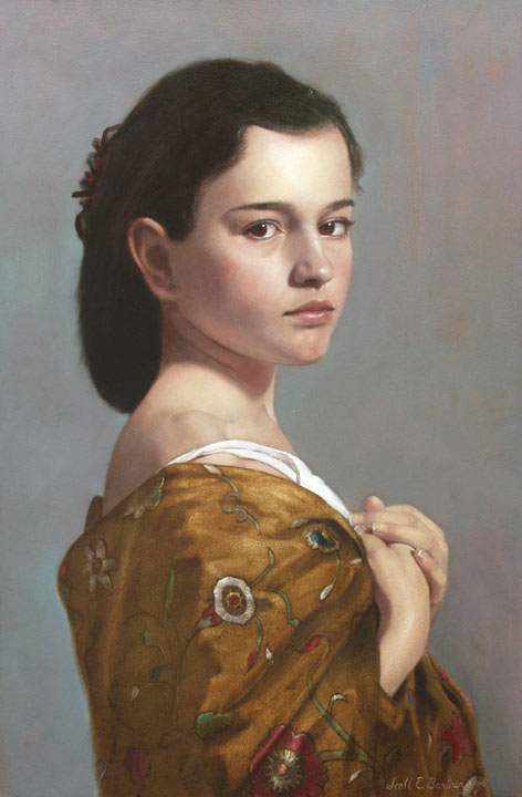
This is the sort of work that always gets lost in the shuffle in these big competitions, since it doesn’t leap out and shout at you, “I am a great painter! Look what I can do!” Like an old master work, this one sits calmly in its frame, confident in its ultimate superiority, regardless of the general ignorance. Just look at that expression, at those eyes! There is no flashy brushwork here to distract you, nothing in the background to pull your eye away. Just a simple direct gaze, unbelievably powerful, like the gaze of a Titian subject. I am shocked once again that the judges missed this one. What do you have to do? Titian himself could rise from the grave and enter one of these contests, and he would be cut in the first round. I truly believe that. What kind of vulgarian could rank The Death of Love above this? The angels themselves wince.
If this paper was useful to you in any way, please consider donating a dollar (or more) to the SAVE THE ARTISTS FOUNDATION. This will allow me to continue writing these "unpublishable" things. Don't be confused by paying Melisa Smith--that is just one of my many noms de plume. If you are a Paypal user, there is no fee; so it might be worth your while to become one. Otherwise they will rob us 33 cents for each transaction.