return to homepage
return to 2006
A Review of Van Nielsen
by Miles Mathis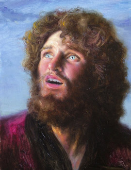
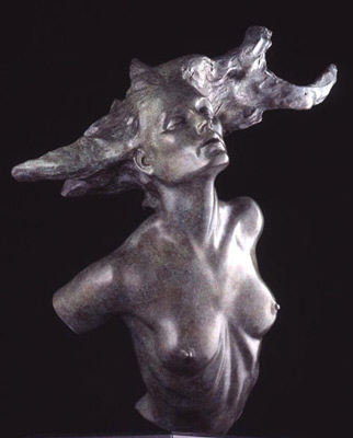
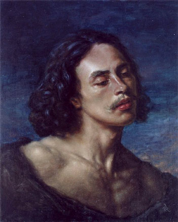
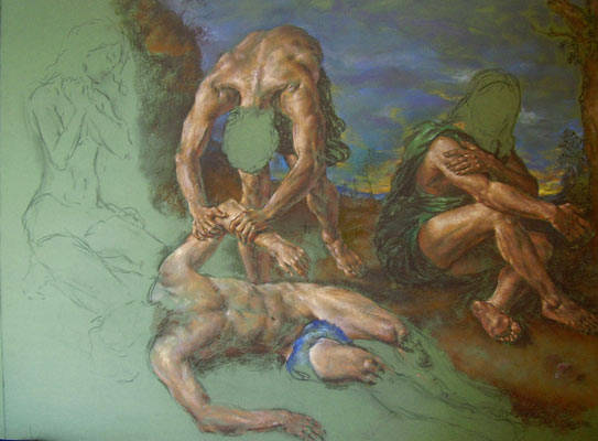
The Prodigal, by Van Nielsen
Some will wonder if I have the “critical distance” necessary to write about my fellow guild founder, Van Rainy Hecht-Nielsen. Possibly not. But I do have the critical distance necessary to make fun of his name. I mean, could it be any longer? We have foreign-sounding words there, hyphenated no less, mixed together with hippy inventions. I always get a mental image of an old Volkswagen microbus, curtained and handpainted, filled with naked Germans and Swedes growling things like “hecht” and “achtung”, all the while the roof leaks with rain. I hope he will forgive me if I shorten it to the more portable Van Nielsen.
There: if I didn’t have the critical distance when I started, I have just created it. Van will hate me for a few minutes, and in that window I can treat him objectively. Beyond that, the reader should know that I haven’t seen Van in more than two years, not since I moved to Belgium. In the meanwhile he has become a devout Catholic, actually contemplating seminary, while I remain a terrible sinner (against the avant-garde, if nothing else). He has gone through half a dozen major crises, while I have been locked away in my cryogenic chambers—impervious to change or outside influence. He has an epiphany almost daily while I still wear socks I bought in high school.
So we are miles apart in some ways. One thing has remained constant, however, and that is my continuing awe at his talent. No, not just his talent, his achievement. His work, most of it done in his 20's, did not show promise; it somehow already included many full-fledged masterpieces. One morning he was a beginner and the same afternoon he was il primo uomo del mondo (as Cellini said of himself).
A casual websurfer will likely cruise his various websites and come away with very mixed feelings. There he has works of absolute genius next to others that are failed experiments, at best. He has first-rate scans next to terrible scans (as have I, admittedly). And there is just so much to look at—oils, pastels, sculptures, sketches, charcoal drawings. An eye used to looking at heavily edited images, all in a single category or genre, will get dizzy.
But I am going to argue that this is one of the things that makes Van a real artist. He is not a market whore like most of the rest, streamlining his output to fit demand. He is not scared to experiment, to learn what he needs to know, to pass through a middle phase that is neither packaged nor polished. I have read William Whitaker saying in a demo that he wants his paintings to “look great at all stages,” as if someone is giving him marks each hour. This is fastidiousness taken to its pathological limit. No doubt he also wants his bed to look unrumpled even while he is in it. But Van is as far as possible away from this sort of wonkdom. He realizes that a painting or sculpture is not an artclass demo, painted in front of an audience of technophiles. It is a carrier of emotion. As such, it must transcend the tight-assed critique of the webcrawler and amateur.
In this review I am going to prove, simply by presenting the reader with images from these same faulty—human—websites, that Van is the greatest wasted talent in the artworld today. In fact, he is probably the greatest art talent in the world, period—wasted or not. Meaning that in my opinion his current and past work is already better than that of the most famous painters and sculptors alive today. In his 20’s he was already mostly beyond them, so that he had earned the right to any number of failed experiments, epiphanies, dead ends, and redefinitions. Even if he gets permanently lost in a moral or marketing morass, he will still have created some of the finest works in the last century.
Let us begin with sculpture, since it is a far smaller field. Realist sculpture is a nearly dead art. There are some very talented animal sculptors, of the Sherry Sander variety, but when it comes to the human figure, you can count the living masters on one hand. Richard MacDonald, Glenna Goodacre, Bruno Lucchesi, Alex Stoddart and maybe a few others. The recently deceased Frederick Hart was another. But not one of these sculptors has ever created works with the beauty and power of Van’s early work. I do not have time for a full critique of each of these artists, much less of all the other contenders whom I will be reminded of later. But I will reveal to you my overview of those I have listed.
[Before I get started, I will pre-empt some complaints by saying that I have chosen these five because they are nearest to being in the classical tradition, following or trying to follow the line of Rodin or Carpeaux. There are lots of other well-known sculptors who are basically outside my argument here, since they are stylizing their figures for one reason or another. In other words, for reasons of their own, they are trying to look African or pre-Hellenistic or Modern or Martian or whatever. By doing this, they can dodge the whole issue of anatomical correctness, since they can claim that all distortions are purposeful. In the genre I am discussing here, there is a rather low ceiling to any distortion, since the figures are meant to look as human as possible. The figure is therefore not a malleable form, used for self-expression; it is given form that must express itself through certain conventions, conventions supplied to it by human nature. There is no hard and fast line here, and I am not claiming there is; but most will understand what I mean. If Carpeaux wanted to give his figure a certain emotion, he put that emotion in the face or limbs of his realistic figure. Most contemporary sculptors don’t attempt this, because it is so damned difficult. It is singly difficult to create the real figure, and doubly difficult to make it look like it is really feeling anything. So they claim to put the emotion in the larger lines and composition, by some sort of stylization. A few actually achieve this, to some degree. But, as I said, all this is basically outside the argument and review at hand, since Van does attempt the singly and doubly difficult task of direct representation of emotion.]
Richard MacDonald is one of the most successful realist sculptors in the world today, with major public commissions and huge sales. 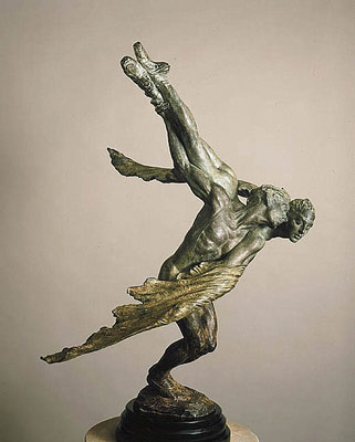
At first MacDonald showed real talent for gesture and for the nude body; also for exquisite patinas. "Doves," one his most popular works, is also one of his most successful works. But his faces were always suspect, and he was, from the beginning, teetering on the edge of bad taste. He soon fell off. He showed his hand early with a predilection for mimes and white-face, which spun out later into couples in high heels dancing the tango and the like. And then there was the gymnast—the square-headed Hercules in tights. MacDonald’s gesture had become caricature.
Since then, he has taken a cue from Frederick Hart (a sculptor I will talk about in a moment) and begun to mass-produce his works in clear acrylic resin, also know as plastic. This is a sure sign that an artist has completely capitulated to modern vulgarity in all its forms. As a part of this descent, his obsession with surface has overwhelmed his content, and the patina and surface marks have become more important than the subject. It is long since he began to hide the fact that he had nothing to say behind a flurry of flash and shine. Like most gallery sculptors, his gesture is now all manic motion, with no gravity.
Despite having a huge technical talent, he has devolved into a slick marketing phenom, plagiarizing himself with huge editions in all sizes. His galleries are now forced to hide his edition sizes, they are so embarrassing. At Greenhouse Gallery there is a $62,000 half-life sculpture, the "Trumpeter," that I believe I remember has an edition size of 175. It is no longer listed in the literature. If you do the math that is almost 11 million dollars in retail for one sculpture. A sculpture with an ugly face. Great hands and arms, yes, but the face is not good. That is probably why he chose to cover it in white paint. And this is a fragment of an earlier work called Joie de Vivre. Should this edition sell out, MacDonald can just point it up or down into another size and order another 175 or so from the foundry.
Funny story. When it first came out this sculpture was called Joie de Vie. MacDonald and I were in the same gallery in Scottsdale and I pointed out to the director that his French was a bit off. Now, my French is far from fluent, but anyone who has done any reading knows that “joie de vivre” is a clich�. You don’t even have to have a French dictionary or a computer to look it up. It is in all English dictionaries, and not even at the end under “foreign phrases” or anything like that. It is listed under “J”.
Anyway, MacDonald is now also showing his drawings in galleries, and from these we can see pretty clearly his true artistic level.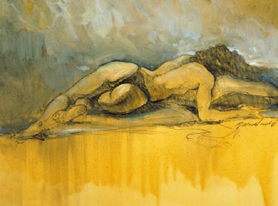
Admittedly that is the worst one I came across, but none of them were good. Like many gallery artists, MacDonald graduated into fine art from illustration. That is why both his drawings and sculptures have no depth. They still look like ads for Coca Cola or Nike. In fact, that is what MacDonald now is: a fabulously well-paid ad-man for the PGA Tour and the IOC and so on.
Glenna Goodacre has less flash than MacDonald and a bit more soul, but she still never manages real beauty or expression. Her public sculptures like the War Memorial are successful without being memorable. They fulfill their function but do little more. Most of her gallery work is just hackwork, a rung above her Loveland foundry competitors but expensive bronze litter nonetheless. If I were king I would declare a ban on all slice-of-life sculpture—boys on skateboards and old men on park benches with dogs and things like that. 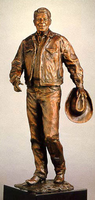
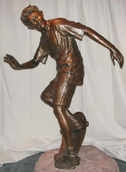
The last thing a crowded world needs is permanent people, cast in bronze, especially when they are so utterly banal. A new Carpeaux might be allowed to add a denizen or two to the permanent population, but the entire Santa Fe output should be melted down and used for something useful, like bedknobs or bottlecaps.
To be fair, Goodacre has done some attractive work. “He is they are”, despite the corny title (and even cornier title explanation—it came to her in a dream) is a fairly compelling piece, even if the lower legs are too short. 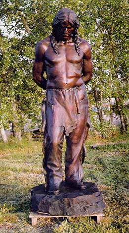
Her maquette for the "Philosophers’ Rock" is wonderful: it is too bad the full-size piece lost every bit of its charm. And her reclining nude “Summer” is pleasant and appealing. 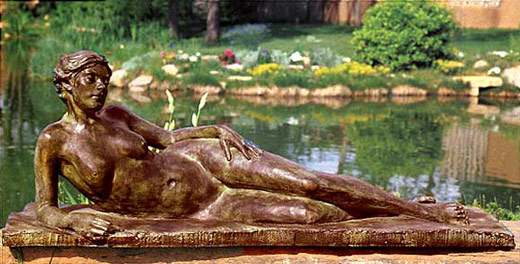
I could see putting it by my pond, had I a pond. But “Summer” also proves my point. Its face, breasts, hands and feet, though good, are not really good. Had I the sort of money that Goodacre’s clients have, I would buy some sculptures from previous centuries, which are just as affordable and which often are really good. Or I would buy Van’s work.
Bruno Lucchesi has done a handful of nice little terracottas in his long life, but hardly enough to justify his inflated reputation. In the 19th century he would have been laughed at as a clutz, but in the 20th he was the cream of the crop. 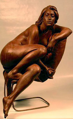
Lucchesi has a knack for overworking, for smoothing any accidental expression out of his figures. One can see this in his technical books, where he occasionally has something going on in his middle stages, purely by chance, that is always gone by the time he is finished. Apparently this is invisible to the man himself, who believes that a monotonous, though mottled, finish is the sign of the master. Like many he finds something soothing in a pinched mediocrity.
Frederick Hart was much like MacDonald, or rather they ended up in nearly the same place. Hart’s clear plastic sculptures and bronzes have the same strengths and same weaknesses as MacDonald’s works—they have unattractive faces, elongated and slightly off, with overcomplex patinas and surfaces that have been overtooled. Everything has been overprocessed, overpackaged, overpatined, overnumbered and overpriced. Underneath this surfeit is a big fat nothing of content and emotion. Any expression or emotion is false, garish, and usually in bad taste. Hart added to this by being in bad taste about Christianity. Possibly there is nothing worse than bad religious art, especially in the age of mass media. Hart’s late work looks like it should be sold on the Home Shopping Network, or on the PTL Club. The whole clear plastic idea was a trainwreck. 
The only place you should buy plastic sculpture of the Pope or of Jesus is at the mall or the State Fair, and it should cost no more than 39 cents. All this was prefigured in Hart’s only great work, Ex Nihilo, which, despite being competent and even beautiful in parts, lacked any real strength of character. Only the Pan gargoyle has any expression; the rest of the figures look like pretty people doing yoga. Hart mistakes writhing for feeling. It isn’t enough to arch your back or have wind in your hair, as the great sculptors understood. Hart’s figures don’t make you feel anything, unless you are used to being cued by Little House on the Prairie and shampoo commercials. And like MacDonald, Hart plagiarized himself heavily throughout his career, selling fragments of Ex Nihilo to the end.
Alexander Stoddart is by far the biggest talent on my list, in my opinion. There are two talents he doesn’t have, though. One is a talent for updating his website. The other is for emotion. 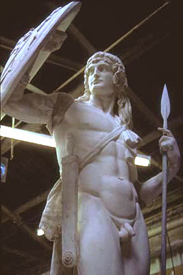
To be fair, he doesn’t care much for emotion in sculpture, so I am admittedly critiquing him by my own standards, standards he dismisses. He is a classicist, and for him classicism is about decoration, elevation, and emotional distancing. In this he is perfectly successful and therefore critically untouchable. However, I still prefer Van’s work to his, since Van hits on three cylinders while Stoddart hits on two. Van’s work is decorative, technically beautiful, and emotional all at once, and I like art that does all three simultaneously. Stoddart finds most emotion like Van’s to be pollution, and that is his prerogative. But I find only fake or forced emotion, as in Hart or MacDonald, to be pollution. Genuine emotion exists and can be perfectly wed to form, and this is the highest art for me. Stoddart’s Mercury’s and Diarmid’s are fantastic, but they leave me a bit cold. It may be that gods and demigods are supposed to leave us cold, but maybe not. The Greeks didn’t think so, and they are considered classical, last time I looked.
Now, Van has not posted much of his sculpture on the internet. Some of these photos I will use are snapshots I took years ago. He hasn’t even thought to steal images from his galleries’ websites, as I have done for him here (see “Vanquished”, below, which I offer here courtesy of Greenhouse Galleries). He is apparently too busy reading Chesterton and the Church Fathers to bother to post images of his best work. He is still posting a bad photo of his plaster cast of “Repose”, when he has a stunning bronze with a great patina sitting around somewhere. But I say, even working with what I have on the internet, I can show you that he is better than all those I have critiqued above.
As a lead-in to that, I must first talk a little about painting. I am not going to list the top figure painters and chop them into tiny bits—I have done that in other papers. I am simply going to post a couple of samples, in order to show my method of judging. Once I have made that clear, I can apply that method in the same way to sculpture.
It is my contention that most viewers have no idea how to judge a figure painting or sculpture. As I have said before, almost everyone seems to me to be judging on peripheral concerns and missing the main line. I have claimed that figure painting is not about color or brushwork or edges or reflected light or politics or decoration. So what is it about, precisely? Could I be more specific? I could indeed. Let us look at three figure paintings, the first by Pino, the second by Dan Gerhartz, and the third by Van. 
By market considerations, they are ranked just as I have listed them here. Van makes a little money, Gerhartz a lot more, and Pino even more. I would reverse that order, and here is why. Go to the eyes first. What are the eyes in the Pino telling you? Well, I have chosen one of the few Pino’s where you can see the eyes, but even here there is nothing going on. It is a blank stare. Every time Pino has a girl looking at you, she is posed looking absolutely face-on and her expression is zero. She has on so much mascara you can’t see the whites of her eyes anyway. And her eyebrows are totally level and her mouth is level. Pino calls this one (tongue in cheek, I hope) “Mixed Emotions”. Yah, she’s a real mystery, that one. The biggest mystery, though, is why she is wearing a white apron with black hose and pumps. She’s not even in the kitchen, but if she were those black pumps wouldn’t be very handy. She might slip in some spilled milk or something, Oh Daddy.
The reason all his “women” are painted face-on is that there is no woman there. These are cookie-cutter paintings produced from mannequins and standard poses. All Pino has to do is change the wig and the apron, surround his lovely mannequin with new pots and flowers and throw pillows, and he has a new “original”. Anyone with an ounce of feeling or intelligence could recognize that these are Stepford wives. There are a thousand dead giveaways, even to someone who doesn’t paint, but the primary giveaway is the eyes. Always look at the eyes first.
Dan Gerhartz is what Pino would like to be, if he has any soul at all. Like Pino, Dan likes lots of color, pretty young girls, and lots of stuff in the background. The difference is Dan knows what he is doing. Dan uses bright colors but knows how to harmonize them. He knows how to create a composition to contain all his flowers and drapes and candles. He knows how to direct all his loose brushwork into a lovely mess. And he knows how to choose models to achieve his goal. This immediately puts him lightyears beyond Pino. The only problem comes when we look into the eyes. We don’t find much there, for the simple reason that Dan is no longer looking there. To be fair, he used to. His early work has more strength, and it is precisely because the eyes were more alive. Dan hadn’t yet become obsessed with the paint, so he was still looking the girl in the eyes. She was telling him things, and through him, us. But now, as you can see, Dan is more interested in the color harmonies and the brushstrokes—which are admittedly lovely. Unfortunately, the eyes have gone almost dead. Not mannequin-dead, as with Pino, but approaching that. They are dead not because Dan has started relying on mannequins. No, they are dead because Dan is married: he can’t risk feeling anything for this woman or girl. He can’t risk letting his wife know that this woman or girl might feel anything about him. So he looks away, at the lovely brushstrokes curling so seductively. And we are left hungry for content.
Now we come to Van’s painting "Twilight." This painting is so far beyond anything Pino or Gerhartz has ever done or imagined that I can’t believe I am even on this page having to argue for it. This is not a mannequin. You are not looking at the background or the drape or the brushstrokes. If you have a scintilla of spirit you are asking how it would be possible to paint a head with more beauty or expression. This is like a head by Titian or Velasquez, though I can’t think of many heads by them that have this kind of subtlety or depth. Apparently this kind of achievement in art is now so far beyond the experience or expectation of anyone that it simply fails to register on the chart. People pass it by without a flicker of recognition, as if they are passing in a speeding car and Van is a unicorn in a pasture of mules.
The artistically blind will say many things in response, I know, for I have heard it all before. They will ask me how I can tell them to look at the eyes and then show them a painting where the eyes are half shut. They will say that this man isn’t doing anything. He is just tilting his head a bit. If Pino’s girls are pretty and vapid, why isn’t this guy just pretty and vapid? For these people, one head is pretty much the same as another. It is a miracle they can even get through the day, they are so terrible at reading signs. One wonders how (or if) they tell their husbands from the mailman. One really wonders how they keep from falling into holes. Actually, come to think of it, most of them don’t. They have been falling through a big hole all their lives.
Nor is this one painting an accident or an anomaly. Look at some others from this series. 
I still can’t believe how good these pastels are. They are neither overworked nor underworked. They don't look like Old Master rip-offs, they look like genuine Old Master works. Meaning, they have that quality without having anything derivative in them.
Or how about this charcoal study? 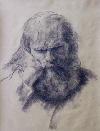
This is also a real study for a larger painting of multiple figures, so in that way it is like the Old Masters' drawings as well. It was not produced to mimic some effect, it was not done as a homage or licked into some sort of fake perfection. It is a real sketch, and has all the of charm and immediacy of a real sketch.
Or look at his full figures. This one is unbelievable. 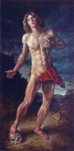
I cannot convey to you the power of this 96” work in a 6” scan, but even here it is clear that we are in a world unlike the one we are used to with contemporary realism. A few others like Anthony Ackrill and so on are beginning to attempt this sort of thing again, but no one else is coming close to this.
I know that those who are judging us all from scans will not be convinced. They will think, “Yes, but Van has a lot of middling work up, too. He is just like all these other realists: halfway back, but no better. All these websites are pretty much the same. A few decent works, at best, but nothing to get excited about.” Well, if I had seen nothing but thumbs pages, and weren’t looking very closely, I might agree. But what I am struggling to get across is that there is a difference. It is clear in person, but it can be discovered even from the websites, if you do a little work. You have to cull out the best works from each artist’s site and then do a direct comparison. Van’s worst works are just as bad as everyone else’s worst works. Hell, even Rembrandt’s “worst works” thumbpage would leave you with a bad taste in your mouth. But it is the best works you have to look at. There are some other living realists doing some good work, but you can look all day and not find works that compare to the ones I am posting here by Van. In my opinion, only someone like Yuqi Wang bears direct comparison, and only because he is technically beyond Van in some ways. But I believe Van is even more expressive than Yuqi.
To make it as difficult for Van as possible, let’s do a direct comparison with Yuqi. 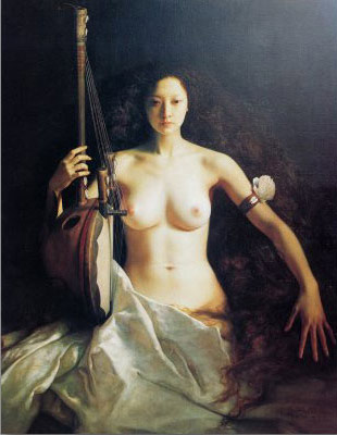
I haven’t seen all of Yuqi’s best work in person, but I have seen some of it, and I have a lovely book he sent me with terrific photos. Yuqi knows some things Van doesn’t about paint quality and finish and light. No one would claim that Van is more technically advanced in any way, except maybe in line quality. But for me Yuqi's heads aren't generally as expressive as “Twilight”. These two pictured are among my favorite heads from Yuqi’s oeuvre, and they are both stunning. But the technique is perhaps more stunning than the expression. They are beautiful, calm, and deep, but they don’t tear your heart out like Van’s best heads do. Whether Van is calm as in “Twilight,” or amazed as in “The Prodigal,” he is at the very pinnacle of expressive capability, and his technique is everything it needs to be.
I don't think Yuqi has too much technique, but it is certainly possible to have too much technique. Think of Nelson Shanks, or even, in a different way, Dan Gerhartz. Technique can outstrip the subject, and in contemporary realism, it often does. More technique would not help Van's best figures; in most cases it would harm them.
Yuqi's technical abilities are so stunning here that I fear some will still not follow me. They will be caught in Yuqi's formidable headlights. So let me peel back a layer and try to be even more direct. What Yuqi achieves that is so rare, beyond his technique, is that he invests his sitters with intelligence. So many of even the finest technicians cannot do this. Both Kora and Lee, above, look beautiful and intelligent and interesting. They are not just real, they are individuals and they are fully aware. But, even so, they are just sitting there, in the main. They are not expressing much of a mood, either with face or limbs. You get very little emotional cue from either one: none, I would say, from Lee, and only a twitch of haughtiness from Kora. They seem to be posing for the artist and are not even fully themselves. They are slightly self-conscious. The pose and setting does not seem to be chosen primarily to express a mood. It is chosen for other reasons or effects. For instance, is Kora's hand spread like that because it is something she does? Is it a natural thing that expresses her personality directly? Or is it something that the artist directed, for a compositional effect, like the vertical position of the instrument in the other hand?
It must occur to anyone that this is intentional on Yuqi's part. Possibly he agrees with Stoddart that emotion is a weakness of some sort. It is a sign of the immediate in a form that should be timeless. Or possibly it is an oriental convention: they take great pride in being more stoic, more inscrutable, than occidentals. Whatever the cause, the effect is that Van's work has a stronger mood, at least to my eye. Van may be giving himself away too much for the Chinese taste, but to my mind that is the artist's job. I want that connection open, not closed. Besides, most who want to express themselves can't do so. Most who value the connection cannot create it. In fact, I would call it the rarest skill. Technical skill is rare. Making a head alive and intelligent is even rarer. Making it also feel is the rarest of all.
Let me be crystal clear. I am not critiquing Yuqi here: he is mostly beyond any critique of mine. He is a great master with his own agenda and his own desires and his own way. I am simply stating a personal preference when it comes to treatment of subject. I am showing the reader how I look at these paintings, and that view may be worthless or worthwhile, depending on the reader. Some will agree and some will disagree. For some few my comments may cause some sun to rise somewhere, while for many my comments will be like an asteroid in the eye. I accept that like I accept the air I breathe. How could it be otherwise?
At any rate, I hope that some of you will now have a better idea what I am looking at in these paintings. In “Twilight,” Van’s man has full signs of life: he is thinking something, and that something is not, “Gee, I wonder why my apron keeps catching on my garter belt?” Van’s people may or may not be beautiful, but they are intelligent. They are real because they are conflicted, or passionate, or amazed, or ambivalent. If they are none of these things, it is because they have a serene depth. A serene depth is not to be confused with a vapid stare, and yes, some people can tell the difference. Some people do not try to shake hands with wax dummies.
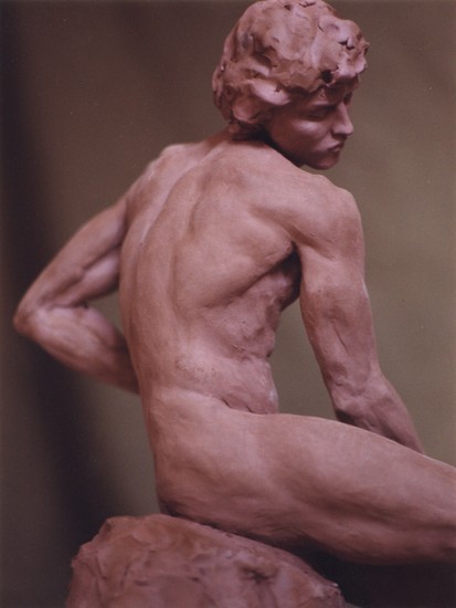
So let us return to the sculptures. As astonishing as Van often is as a painter, he is, I think, even more astonishing as a sculptor. Let’s start with this plaster self-portrait (why oh why does he not have a pic of the bronze, which does exist?) 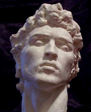
No one, absolutely no one, is doing heads this gorgeous these days. Stoddart comes close, but again, he lacks the expression. His male heads are just as beautiful, maybe, but they lack this kind of life. The rest of the top names don’t even come close. Goodacre’s best male head is the big Indian, but he is neither this beautiful nor this expressive. Sabin Howard can technically do what Van does with a male figure, but he hasn’t got the models or the expression to match him. If this isn’t clear at first, go to Howard’s drawing section on his site. While Van can draw better than Liberace or Parrish, Howard is posting a Codex rip-off. Here is the direct comparison.
[Sabin must have read this article because he took down his drawing and immediately went to a macromedia presentation, where you can't download material. When my website was shut down by Yahoo and I had to rebuild, I lost my copy of Sabin's drawing. I guess you will have to take my word for it that Van draws better than Sabin. Or you can visit both their studios. I highly recommend that.]
But let us return to Van’s self-portrait. Look at the eyebrows in Van’s work. That is where the action is. Subtle cues tell us, “pain.” The surface of the sculpture is stopped at the perfect point, neither too smooth nor too rough. And the hair is likewise in the perfect state of finish to support the expression without usurping it. Van has instinctively done everything right, all at once. I can’t stress too much the rarity of this.
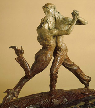
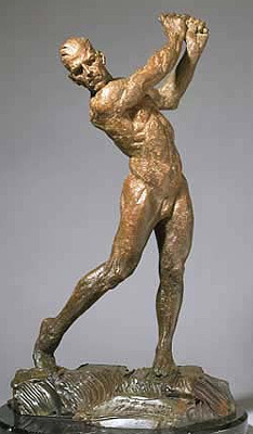
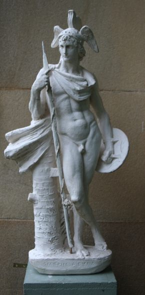
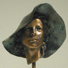
You will say, it is one thing to do everything right in a head, another entirely to do everything right in a full figure. And I agree with you. But Van does everything right in full figures, too. Look at these three. 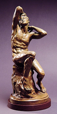
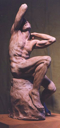

Now, Van hasn’t done me or himself any favors with these photos. He does make us work for it. Nonetheless, a trained eye should stop and say, “Hold on just a darn minute, something is going on here, and it isn’t a grab for my purse.” You just don’t see work like this anymore, and you shouldn’t need a macromedia presentation to cue you to this fact. Look at the amount of expression Van has achieved in this clay original of “Thanatos,” the last one pictured. So subtle and so lovely. A tiny piece of absolute perfection. This clay is not overworked, it is not crushed into a soulless lump of decoration, a bauble for the ignorant. It is not fancified with toolmarks or tarted up with meretricious motion and swirls. It was not created as an anatomical study or a technical tour de force. It is calm and simple, a delicacy fit for a high taste.
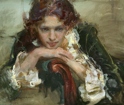
As another example, look at this portrait of a young woman. 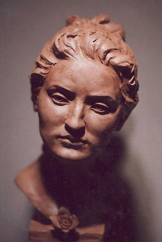
I take the blame for this amateur photo, which I took myself. Thank goodness I did, or we would have no record of her at all. Even through the too-heavy shadows you can see that this is sculpture on an entirely different level than we have become used to in the 20th century. This is like one of Bernini’s “speaking likenesses.” This is not an idealized head, or a too-pretty child. It is a real woman, with thought captured in her face, with a word almost on her lips. Once again, it is the eyebrows, and those little tilts and turns, that are so telling. Her skin is perfect, with the smoothness of skin, but not the oversmoothness of polished stone. She is an individual, with that personal nose and chin of hers—real but not perfect.
Compare her to Goodacre’s women. They all look slightly dopey, as if someone has run a hose up their necks and siphoned out all the contents of their heads (many are overpolished, like the fragment here). They are the female counterparts to her Reagan sculpture. Consider for a moment one of her best sellers, “Chapeau Nouveau.” 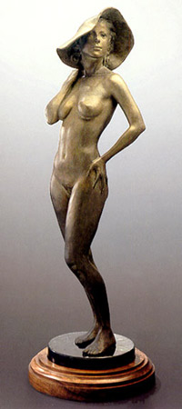
Great body, nice technique by Glenna, but that face is right out of Pino (and the hat doesn’t help—who wears floppy hats in the nude?—no one, not even on nudist beaches). And the pose turns it into a complete clich�. Women don’t stand like that anymore, unless they are in tight shorts on a USO stage, making fun of themselves. I love the past possibly more than anyone alive, but this is unintended camp, not nostalgia. “Chapeau Nouveau” inhabits an artistic no man’s land between pin-up and serious nude.
Or compare Van’s men to Goodacre’s “Athlete”. 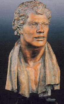
This guy looks like Robert Redford, if Redford had an IQ of 40. Witness those eyes, dear reader: mannequin eyes. The tension in the eyebrows, combined with that slack lower lip, creates not intelligence but confusion. He looks like Joey Tribbiani trying to subtract 319 from 4562. And Goodacre really is better than the other gallery sculptors, again. I am not saying she doesn’t deserve to be at the top of the known field. I am saying that the field is very very thin.
Unfortunately, this thinness doesn’t make it easily penetrable. The galleries have somehow found a clientele for mediocre work, but they haven’t found a clientele for really good work. I know this sounds counterintuitive to all the businesspeople out there, but there it is. The cream doesn’t rise to the top, since no one is shopping for cream. All the people with taste were driven out of the realist market decades ago, and they haven’t yet returned.
Van isn’t the first young artist to discover this. I have seen many catalogs over the years from the major sculpture competitions, and there is occasionally a real stand-out, some young man or woman whose sculpture turns your head like Van’s does. But for some reason these stand-outs get ignored by the judges, the galleries, and the clients, and in a few years no one has ever heard of them. They have been forced into advertising, or have stuck their heads in the oven, or something.
So when people say to me, “C’mon, Van is what, 32? He has to pay his dues,” I say, “I wish it were that simple.” I wish to god that all he had to do is keep at it. Show me the young man or woman who has kept at and eventually forced the market in his or her direction—meaning, found a clientele for good work. The ones who eventually become successful are the ones who give the market what it wants. They dumb down to the given level and start supplying the ever-present demand for Reagan statuettes or plastic Jesuses or couples dancing in high heels or Native Americans in big blankets. Real art would look out of place in a contemporary realist gallery—does look out of place—that is why you don’t see it. The other reason is because it doesn’t sell.
The reason it doesn’t sell is because, in the rare case it is accidentally exhibited, it is entirely too subtle for the modern eye. Most modern people need to have their arm chewed on for a while before they will cough up any dough. They need bright lights and slick literature and guarantees of authenticity and investment. They need to be assaulted with colors or politics or fat brushstrokes or shiny varnish or footwide frames or celebrity endorsements. A simple work of art is under the radar of such people. A heartbreaking twitch of an eyebrow like in Van’s “Twilight” is invisible in the maelstrom of vulgar eddies pulsing through the contemporary gallery. The client is washed along in a filthy sea of false superlatives and faux-talent and hasn’t time to breathe much less swim to any real shore.
I do believe that there remain clients out there for work such as Van’s. But the realist galleries are, for the most part, simply not addressing them. It is not a market easily mixed, either. You cannot appeal to morons in the morning and intellectuals in the afternoon, from the same gallery. It is like having a restaurant that is both smoking and non-smoking, with only a screen in the middle. The non-smokers resent the smoke and the smokers resent the fresh air. By the same token, people with taste do not want aproned and pumped semi-tarts looking vapidly at them from the walls, anymore than (I must suppose) the tasteless want smart people looking at them from the walls, making them feel stupid. Which is as much to say that Van’s clients will not want to have to sift through rooms of garish trumpery to find him, anymore than Pino’s clients would want to have to wander through rooms of dark and dreary Old Master paintings and sculptures to find a sunny mannequin in lipstick and push-up bra.
As I have said before, part of the problem lies in the fact that no one ever says anything substantive anymore. The realist market exists without a spot of criticism. Sure, the avant garde dismisses it as a whole, but no one even takes the time to make fun of Pino, like I have. There are no pasquinades, no public lampoons, and precious little shop talk. This allows the market to sail along with the impression that it is a serious business.
It is really a strange state of affairs, if you think about it at all. When in history has any business been so insulated, especially art? Think of all the criticism the Impressionists had to wade through, or even Sargent, with his Madame X controversy. Or Whistler, by god. Now the current wisdom seems to be that realism has suffered so much from Modernism that it is best left alone, like a rabbit that has been mawled to within an inch of its life by a pack of greyhounds. Best leave it to die, or to crawl under a bush and lick itself back into the world.
I don’t see it that way. I believe that the ill-formed blanket dismissals of the avant garde should be forced back down its throat: that the critics in that corner should be told to make sense or shut the fuck up. But the silence within realism is just cowardice. We aren’t doing realism any favor by letting it be dominated by Pino and Thomas Kinkaid.
The average client never hears a bad word, never hears a peep of dissent, so he assumes that he is on the right track. He is never shown how to take a closer look at something that is right in front of his face. When has anybody even bothered to take the time to do what I have done here, putting images and words together with an opinion that goes in a definite direction? It is considered impolite and impolitic of me to attempt it. Better I should let art history wander off into another swamp, since I would be limiting its freedom if I suggested it go in another direction. Better let the client waste his money as he sees fit, since he will not thank me for ruining his past investments. So what if he is a better man tomorrow? Perchance he does not want to be a better man, only a richer one, and I am useless in that pose.
I will close by being even more transparent, if that is possible. When people start talking about paying dues, I have to wonder if they know what they are saying. Paying your dues in sculpture, for instance, is a hell of a lot more than keeping your hands wet with clay all day, or keeping your nose up, or keeping resumes in the mail. To even get started with a gallery, you have to have some bronzes. You can’t sell piles of dried clay or wax. Now, bronzes cost almost as much for the artist as they do for the client. Foundries don’t work on spec, you know. And banks don’t give loans to artists. Nor does the NEA, or any other organization. Realists are out of all the loops from the beginning. So what happens is that a young sculptor pays all his dues—which he may have earned by waiting tables for several years, for instance—to make a few bronzes. He pays some more dues to get photos and cards and websites, in order to get a gallery. But if nobody buys those initial bronzes, he cannot afford to make any more, and he goes under.
You will say, the same thing happens everyday in every business you can name. People take their shot, and many tank. That’s right, but normally it is the ones with inferior products who tank. Or the ones with inferior PR. Good art in a good gallery should sell. Well, it's not selling, and the problem is with the market itself. Remember the movie Amadeus, and the line where Salieri says to Mozart, “My dear Wolfgang, if the public does not like ones work, one must accept the fact.” Well, as you sit in the audience, do you accept the fact for Mozart? Of course not. You think, those stupid Austrians. You think, what else could Mozart have done? He created incredible music, he presented it at court—the greatest PR possible—and still he basically failed, as a business. He went broke, got depressed, and ended up in a common grave at 35.
The artistically blind will have an answer for this, too, for I have heard it again and again. “Well,” they will say with a shrug, “If the Emperor Joseph couldn’t get it right, how do you expect the prole Americans to do better? You are only proving that the problem is eternal. Why should Van find it any easier than Mozart?”
And I can only answer, “Quite so. Best to admit that the world is a pisspot and always was, getting worse in fact. Best not to try to do better. For that matter, why even try to create great works? Why not just jump into a common grave to start with, as a matter of efficiency?”
This is what the avant garde has done, you know. They have considered the fact and found it impractical to start down a road where they must lop off their ears or die a pauper at the end. There is no educating the buyer, or shaming him into the proper purchases by any old-fashioned means. So rather than jump into a common grave right out of university, they let the great works lie and they go another road altogether. It would be as if Mozart had seen it all coming and had had the foresight to go into shoe repair or plastics. I suppose this is what we must want, if we are consistent. No use watching romantic movies and calling the Austrians idiots. It was Mozart’s fault for expecting to make a living. He was a fool and that is that. We now know better. We know not to expect anything, and we are never disappointed.
But there is another answer, and it is not so jaded or illogical. We are not in an Austrian court run by an inbred family of fools; nor are we in a nation or a world where intelligence is utterly extinct. A few dozen people out of the billions in the world might make the comparatively small effort to discover new talent and invest in it. Rather than wait for some gallery to send them a flier, or wait to see an ad in a magazine, or wait for some institute or foundation or agency to spend their money for them, or wait for some self-anointed expert to tell them what is hot, they could show some personal interest in the fate of the world. Just as people used to take the time to raise their own children, rather than let the schools and media do it, some few of them used to get upon their own legs, walk over to the artists’ studios on the poor side of town, and make their own judgments. If they didn’t know what they needed to know, they studied. They read a book, for instance. And they talked to real people, face to face. Not salesmen, but the artists themselves. In doing this, they came to understand both character and quality.
Clients will now travel the world to visit galleries and golf resorts, but if I suggest they visit some artists’ studios directly, they look at me like I suggested they visit sweatshops or ammunition factories. They are flabbergasted. Their main concern seems to be that they might miss a tee-time, or that their Porsche SUV might pick up a nail in the tire. If they did anything that wasn’t scripted and pre-approved, insured and shrink-wrapped, they might explode.
People will travel to the tiniest village, teetering on the edge of the map, if they are assured of a local ale or a special tribal corncake or a chocolate in the shape of a wombat. But if I suggest they drive 20 minutes from the big city in order see an artist’s studio, they look at me like I just sneezed on their Tag Heuer. They would apparently just as soon squeeze their caviar directly from the fish, kill the veal themselves, or take a guided tour at Roto-rooter.
You will say, of course they would. Why would they want to go to an artist’s studio and be crucified? But I remind them that there was a time when artists and clients were both civilized human beings. Clients didn’t show up at artist’s studios with a mouth full of chewing gum, carrying throw pillows under their arms to be color-matched. They didn’t show up talking on cellphones, fingering their palm pilots, talking about Tiger Woods and Barry Bonds and the bonds market and the Da Vinci Code and how that painting looks like Jennifer Aniston and that one like Joan Rivers at 30 and that one like Danny Devito.
It is hard to believe, I know, but less than a hundred years ago, clients might arrive at an artist’s studio and talk about literature—not Harry Potter but Edith Wharton, for instance. They might take turns with the artist at the piano. They might discuss the plants in bloom and the birds in the garden, even if they weren’t women. They might mention history or real museums or any number of non-annoying things. And if they did this, the artist might be charming, too. He might have some interesting things to say about any or all of these topics. He might play them a Schumann piece they hadn’t heard in a while. He might show them a favorite book or an illustration by Arthur Rackham or a dark corner of a painting that he especially loved, all without making them feel in the least bit unwanted or out of place. And they might actually find the time better spent than in the 19th hole drinking martini after martini, or at the garage, buying another set of useless chrome rims for the Range Rover, or by the pool, watching the sun through their Chanel sunglasses as it turns their skin into sausage casing and their lips into rubberbands.
So, client and buyer, do the work! Nor let the modish maven shirk what his great forefathers did. The cradles have all been filled correctly, but you must discover the soul of the child within.
return to homepage
return to updates
If this paper was useful to you in any way, please consider donating a dollar (or more) to the SAVE THE ARTISTS FOUNDATION. This will allow me to continue writing these "unpublishable" things. Don't be confused by paying Melisa Smith--that is just one of my many noms de plume. If you are a Paypal user, there is no fee; so it might be worth your while to become one. Otherwise they will rob us 33 cents for each transaction.