return to homepage THE 2008 ARC SALON
return to updates
by Miles Mathis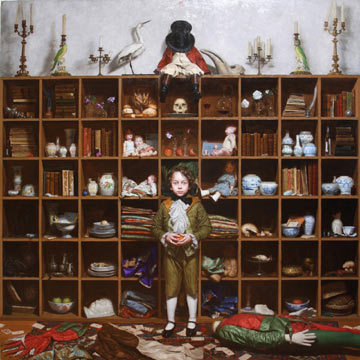
I give up. I want out. I want nothing more to do with realism. If this is art, I need to get into banking or something.
This is the last year I will bother to review the ARC Salon. It is getting too embarrassing. I had already refused to enter because I knew it was a waste of time: I had made too many enemies and could hope for no recognition in that direction. I might as well throw my slides into the street and hope the rain washed them into the right hands. But now I don't even want to be seen commenting on this tragedy. I need to burn the final bridge. I am confident I know how to do that.
A confluence of bad entries and atrocious judging leaves me almost nothing to say, and even less of praise. I had tried to be generous in past years, but it is time to dig a hole and bury all that.
Last year I commented on the lack of entries by Dan Gerhartz. Turns out that was because he was judging. This year I took the time to dig out the prospectus, which told me that the judges for the 2008 Salon are Nelson Shanks, Gabriel Weisberg, Paul McCormack, and Fred Ross. I can't load all the blame on them, since I saw almost nothing at any level that I liked, either among the award winners or among those passed over. If I had been the judge I would have been tempted to call it a complete wash and throw the prize money into the sea.
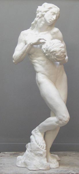
That said, the judges still managed to put the absolute worst work at the top, as in past years. The best of show (above), by Hiroshi Furuyoshi, is frightening in its awfulness. It is 4096 square inches of ostentation, bad taste, and claustrophobic clutter. The central figure looks like a Disney CGI conception of Little Lord Fauntleroy, without the charm. The eyes, drawn wrong, make the boy look mad, which may or may not have been intentional—but it is hard to care. The facial expression is another manufactured mystery among a veritable smorgasbord of manufactured mysteries. I can't imagine anyone bored enough to study this painting for signs of sense. I have no doubt the artist has hidden lots of meaning in each cubbyhole, but I can't be bothered to look there for it.
This is clearly Nelson Shanks doing. He loves clutter like this: too much stuff painted with too much color, too much blending, and too little composition. And zero subtlety. Instead of painting as the search for beauty or expression, we get painting as exponential bragging.
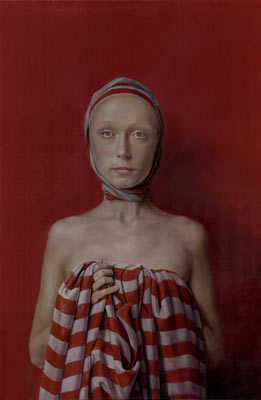
The first place painting, Anna by Oleg Radvan, is also awful in its modern phoniness. It looks like a John Currin painting, or an Odd Nerdrum. The artist is trying very very very hard to be cool and avant, so that he can show at the Forum Gallery and maybe, with some luck, be invited to the Whitney. The judges must have huddled, agreeing in a bloody whisper that this choice might build a bridge to the modern market. This is the kind of painting that the critics in New York might even like. It has no real expression and no real beauty, but it has an au courant weirdness sitting on it heavily, like an elephant worn as a hat. It doesn't make you feel anything—except possibly a mild disgust—but it gives critics and other idea-people lots of room to talk.
I give this choice to Weisberg, as the writer. Just as Hilton Kramer has embraced this sort of modern realism, possibly Weisberg has decided to embrace it for the same reason. When the critic nuzzles this sort of painting, we see the wallflower winking to the crowded floor, the nerd combing his oily hair to be noticed by the fancy girl. Giving speeches attacking the new world gets old after a while, and even the men in wingtips need attention. Nerdrum knew how to get it, Currin knew how to get it. Maybe Ross and Weisberg can get into the rave at last, by snuggling close to the cool guy when the doorman studies the stamps.
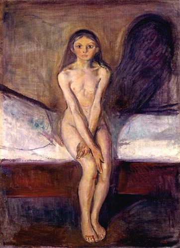
Still, odd it is that Fred Ross should forbid me to write about Munch, then give a top award to a painting like this. You will say, yes, that is odd, but it is also odd that I should praise Munch's Puberty and then damn this painting by Radvan. So I will stop a moment to tell you why. Munch's Puberty is weird, by classical standards, but the weirdness is not manufactured or fake. Munch successfully captured the awful scary otherworldliness of puberty, as felt by a young girl. Radvan captures nothing here. He has tried to capture “modern bleakness”, perhaps, but that is too broad a feeling to capture with a blank stare and an ugly stripe. Radvan has achieved nothing beyond positioning himself as a modern. The painting doesn't do anything; it conspicuously and purposely fails to do a lot of things. By sailing wide around beauty and expression, it screams “I am a modern!” In this way the painting is not so much a work of art as a statement. That is why the critics will like it, if they do like it. All art now is supposed to be a statement. Old-fashioned art is never a statement, and modern art, no matter its form, is always a statement.
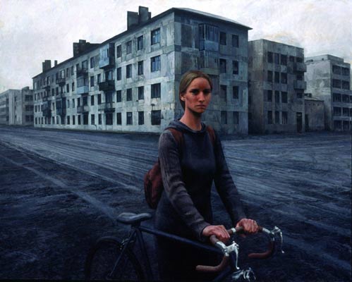
Aron Wiesenfeld's Girl with Bike, from the 2005 Salon, was weird and bleak, but it was not modern in this sense: it wasn't a statement. Like Munch, it was a successful depiction of a very strong mood. It was modern only in that its subject was contemporary. But the artist's intention was classical or traditional: he used the scene to create the feeling directly. Radvan doesn't do this. Radvan uses realism to undercut realism, to undercut expression itself. Although their styles are similar in some ways, Radvan is like Currin but Wiesenfeld is not. Wiesenfeld borrows the modern style, but he has a talent for expression that cannot be snuffed out. To be accepted by the modern market, he will have to either excise it, or turn it completely to pathology.
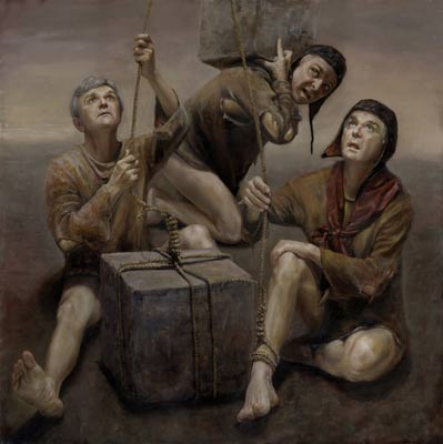
We can see this is the road Radvan is on with his other entry in the Salon, Test Pilot. This painting is actually much much worse than Anna. Test Pilot is a very poor pastiche of Nerdrum, down to the leather caps and the smocks painted straight from Rembrandt. What makes it infinitely inferior to Nerdrum is that Radvan apparently snatched his model from NBC Nightly News. He has painted the same 60-something Republican lobbyist or anchorman three times, barefoot, sans pants, avec ropes and blocks of stone. Why? Do you really want to ask that question? Could there be a good answer? Maybe this is meant as a parody of Nerdrum, showing how ridiculous the entire fake-myth motif is. If so, it could have been made much funnier, with, I don't know, maybe Obama, Pelosi, and Geithner in leather caps, with erections, flexing their feet and singing to the moon, as Bush and Clinton squat on the edge of the forest in approbation, using the Glass-Steagall Act to wipe with.
But I think Test Pilot was meant seriously. I think Radvan is trying to follow Nerdrum, not ridicule him. This makes the painting so gloriously awful that it must pull all else down with it: all of Radvan's other work and all of the judging in the Salon. If Leonardo had entered two things in the Salon, Mona Lisa and Test Pilot, I could never look at Mona Lisa again. The fact that the judges found Test Pilot good enough to make the finals means that all four of them should be banned for life from judging.
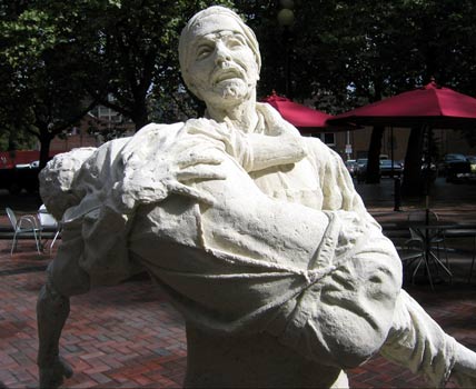
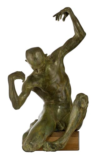
We see this again with the top prizes in sculpture. The apocalypse is really just around the corner. I am convinced of it. It would have been better had realism stayed in the grave. Contemporary realists aren't taking the edge off God's wrath, they are doubling it. Why is Lot's Tribe: Pieta, by Mike McGrath, in the top spot, unless the judges are looking to God to spare them from the ice and fire? To begin with, the title doesn't make any sense: it can't be about Lot's tribe and a Pieta at the same time. A Pieta is a depiction of Mary grieving over Christ. Just look it up in the dictionary. Beyond that, the sculpture is a technical dodge. It is made of salt and the people are melting, so they don't have to look good or be completely sculpted. Convenient. If the man has holes for eyes and no lips, well, you would too if God had hit you with a dessicating ray-gun. Convenient. No doubt the judges were impressed by the novelty of it. They are not impressed by the novelty of modernism, but a little novelty in service of the Bible and realism is Okey-Dokey! I must suppose that the sculpture is standing on a grating so that the public can watch it melt in the rain, or something like that. It appears that one of the thumbs already fell off, but that is just part of the spectacle. It is a temporary sculpture.
In second place we have a Deon Duncan sculpture, a little half-naked boy in a hat, Tom Sawyer at eight or something like that. Fairly well-sculpted, but boring. He is not beautiful or interesting or expressing anything, so why is he here, standing in for art? Duncan's other entry Marin should have clued in the judges, since it is similar but worse. It shows us the lack of expression in pose and face was no accident. Again, the wooden stance and the head like an empty gourd.
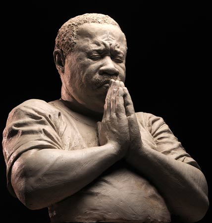
Phillipe Faraut, one of the few real technical masters, offers a dud in third place. Again, not beautiful, not expressing anything real, just a manufactured prayer to the judges, to spare a holy man from the final cut. Twain was wrong, patriotism is only the next-to-the-last refuge of a scoundrel: even better than the flag is the Bible.
Republicans seem to love to give awards to black people praying. Remember that the best of show in 2006 was a Dean Mitchell painting of a black woman with her hands formed like this. Better, I guess, than paintings of black people giving speeches or protesting racism or throwing bricks through bank windows. As Freud told us, religion is a great way to keep people—black or white—tame and subservient.
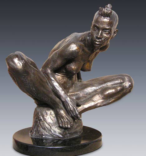
Kraig Varner should have won the sculpture category, and probably best of show, for Africa. I don't usually like gratuitous tooling, as in Richard MacDonald, but the rough marks seem to me to work here. I like both the expression and the pose. I also like the technique.
Cody Swanson did lots of things right with Salome. Her facial expression is really nice. He should lop the head and show it alone. But the body is all wrong. That is a man's torso with breasts, and Cody has studied Michelangelo too long. Michelangelo's only weakness was the nude female, and we don't need to copy that. Yes, women do look like that sometimes now, when they are sprinters drugging up for the Olympics, but I don't think they had steroids back in biblical times.
Robert Bodem's Petrouska is very well done, though it is misspelled and doesn't look like Petroushka. I would give it second place nonetheless, simply for technical virtuosity. Not crazy about Bodem's yellow/black patina, but I have seen worse. His sculpting is first-rate, there is no getting around that.
Only one other nice thing to say, and I will get it in here while my ire is idling somewhat. I like Yuri Diatlov's A Girl. It is illustrative and doesn't have a lot of depth, but it is well done. It is completely successful on its own terms.
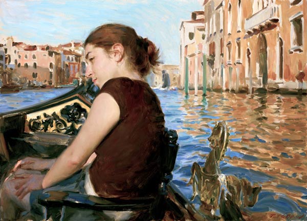
Now back to the ire. Paul Oxborough is really beginning to get on my nerves. He got caught in 2006 with his head up Chuck Close's ass (see my critique of the National Portrait Competition), and he is still riding that obsequious pony here with another portrait of Close. He and Chuck should just move in together—then they can go to parties and bow to the promoters in tandem. Paul better keep his shoeshine kit in good order, since he gets lazier every year. His other entry is a horrible Sargent knock-off called The Grand Canal. I actually got out my Sargent books to see if I could find those exact brushstrokes. I know I have seen that water somewhere. But Sargent would never be caught with a sky like that! Is Paul being paid by Nike now to use paintsticks, or is that Crayola? The shirt is painted the same way: 70 square inches, one brush, three minutes of work. The hands are distressing: a sharpened forefinger; a middle finger short and fat, and a pinky long and thin. Then, look at the gold mess behind the girl: is that a boat ornament or has a golden seahorse just risen from the canal to nibble her vertebrae? I like some energy in the paint handling, but this is a mess.
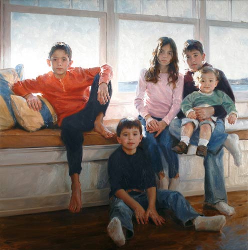
Oxborough's third entry is a group portrait of five children. The drawing is good, but we have to wonder if Paul is in control here. It appears that he just drove in one Saturday and took a few snapshots: the drive-though portrait. He couldn't get the kids to change their clothes, couldn't get Mom to go shopping, couldn't find a paintable background, and couldn't bother to arrange a pose or a composition. So like Pearlstein, he just painted whatever happened. Maybe he can do a portrait of Pearlstein next.
The kids in socks look like they are wearing stone clogs. There is no color harmony, since the red-orange shirt can't go with the pink shirt can't go with the yellow striped pillows can't go with the tan cushion. The children all look bored or sullen, except for the little guy who is chewing his cheek from the inside. These are not bad looking kids, especially the girl, and with a little effort you could make them presentable. Here they are no different than they would be from hour to hour. Why does anyone need a portrait of that? I'm sure Oxborough got a big fee for that many heads: he might have bothered to do a bit more work for it. He should give it a Whistler-esque title: Sweatsocks and Bluejeans: a (non)Harmony in Red-orange and Pink and Yellow and Tan and Blue and Purple and Green and White and....

Dan Gerhartz has fallen from grace in much the same way. He is painting now to feed his family, and god does it show. With In Her Care, Dan keeps a lovely sense of color balance, but has lost his famous brushwork. This just looks quick and lazy. And the yellow reflection in the water is simply ugly. That grubby paint quality looks more like Nicolai Blokhin than the Gerhartz we knew in the 90's. Everything is going from loose to mannered. Look at the edge of the hair, how he is using those ragged scumbles where they aren't necessary.
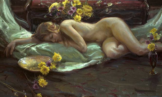
His second entry is The Crescent Cradle, which I badly want to like. I have been looking for a Gerhartz nude for almost 20 years, but I think he is too late. He has to tart this one up with those sickening yellow flowers. The last thing you want to do is drown out a blonde girl's lovely hair with bright lemon yellow in the foreground. The pattern on the floor is lazy, and the blue-green sheet is a blob. The hair is too spicky and the skin has too much color in it. She is too purple and yellow. The thumb is a lovely shape, but the hand and arm lack definition because they are lit wrong. They are lost in a half light, and we miss them in the glare of the fully lit flowers and the glint of the bowl. This is upside down. The lovely hand should be featured, with the bowl and flowers in supporting roles, or pitched out the window. Beyond that, the painting was simply done too quickly. It is 60 inches, and probably took a matter of hours. We are all proud of Dan for painting from life, but he needs to book about thrice the model time.
His third entry is Midsummer's Night, but it looks nothing like the title. The ghastly flowers are glowing from every corner, lit by either the midday sun or a 500 watt bulb. The pretty girls are at a vapid maximum, expressing large amounts of bourgeois nothing. Everything is painted as a blob: the hands are boneless, the dress formless, the couch draped and depthless. Against this, the toes are strangely square, as if they have been filed down or excessively clipped. Somehow a toenail reflects in the middle of the night. The bluegreen dress shines with an ugly butterscotch yellow, along with the shoulders and hair. Beyond that, the whole concept reeks of a set-up, since what eleven-year-old girl wears a strapless taffeta gown to sleep on the sofa in the middle of the summer? We are at the other extreme from Oxborough here. Apparently the modern child will either wear bluejeans and sweatsocks or taffeta: there is nothing in between.
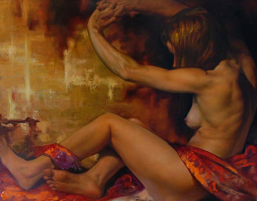
Christopher Pugliese's entries are also strange. He is trying something new, but it ain't working. In both he has seated figures fighting against their frames, for reasons not clear to us. But he has completely lost control of his backgrounds and color harmonies. The figures are smooth but the backgrounds and drapes are rough and thick and scumbled. It must be a purposeful juxtaposition, since it couldn't be accidental, but there is no aesthetic justification known to me. Maybe he took a shine to Oleg Stavrowksy, and decided to bypass trying to set his figures in their environment in a realistic fashion. It is willful, but it is not logical or beautiful or powerful, in my opinion.
The figurative category is a total fucking loss. Where is Lipking? Where is Burdick? Where is Bartner? Where are Mary Minifie's cute little people? Why didn't Mike Malm make the cut? Did Wiesenfeld really only enter the one charcoal? The only thing I can stand is Derun Liu's Xiou, which is at least (mostly) honest and well painted. But why paint half a lightswitch? It pulls your eye off the girl for no reason, except to yell once again, “I am modern!”
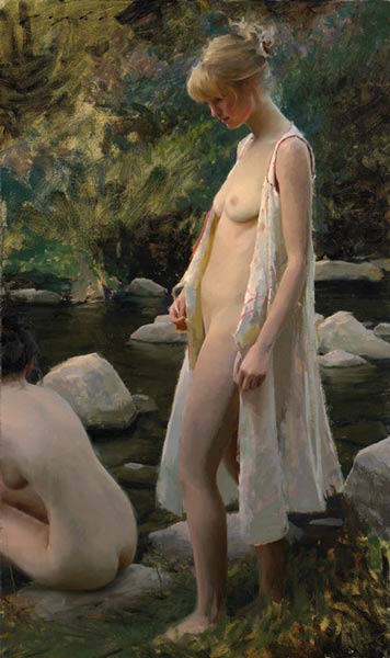
Oh how we needed Lipking's Last Light, to show what I mean by subtlety. It was painted quickly from life, but it isn't lazy or rushed or faked. It doesn't have 10,000 books or flowers in the background; it isn't modern; isn't making any statements. It is the best thing he has ever done. It is beautiful. I am not sure it was best to cut the other nude in half, but we can forgive him that—it maintains a balance even so.
We don't even get a nice Glenn Harrington in the landscape category like we did last year. Nothing exceptional.
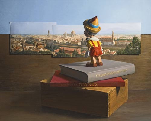
In still life we get one chuckle, from Jonathan Queen's First View of Florence. First place to him, and nertz to the rest.
In drawing, nothing but Aron Wiesenfeld's Suspended, which shows lots of character and iconoclasm, but which isn't as fetching as The Delegate's Daughter or even the Fish Gatherer.
This show, like all the other realist shows, is a sign of the times. Nearly all entries are from the sort of artists who would have been assistants in the past. They would have painted trees for Rubens or flowers for Van Dyck or drapery for David. They are talented, often hard working, and can paint anything. Problem is, they have no real eye for beauty, for composition, or for subject matter. They usually have no eye for color harmony, and are blind to mood and depth. This situation, caused by egalite, might be ironed out if the judges had an eye for beauty, but the realist judges are normally just more ambitious and more successful assistants. They have reached the top of the market one way or another, but in the modern world you don't reach the top of the market by having an eye for beauty. You reach the top the market by producing the required vulgarity for the vulgar clients. This is the reason the contemporary realist show looks like it does, and why it is self-perpetuating. The judges can only judge what they can see, and they cannot see real beauty or subtlety.
And ARC? I think ARC is finished. Five million hits a year? So what, I get a million on my site, and do only negative PR. ARC will not rent a gallery or have a real show, and the judging gets worse every year. I guess next year they will line up Pino, and the year after Thomas Kinkaid. After that the only way down is to hire David Hasselhof, Paris Hilton, and Charo to judge. I honestly think Charo could have judged better than Shanks: she could not have judged worse.
That is where we are headed, I kid you not. Here in Taos, Dennis Hopper is curating a show at the Harwood Museum. Why? Because he spends a lot of money on bad modern art. The show is running concurrently with the “Taos Summer of Love” commemorating the 40th anniversary of Easy Rider. Maybe the ARC Salon next year can run concurrently with the 150th anniversary of the Republican Party, or the 50th anniversary of Gidget Goes Hawaiian.
If this paper was useful to you in any way, please consider donating a dollar (or more) to the SAVE THE ARTISTS FOUNDATION. This will allow me to continue writing these "unpublishable" things. Don't be confused by paying Melisa Smith--that is just one of my many noms de plume. If you are a Paypal user, there is no fee; so it might be worth your while to become one. Otherwise they will rob us 33 cents for each transaction.